
PONSSE
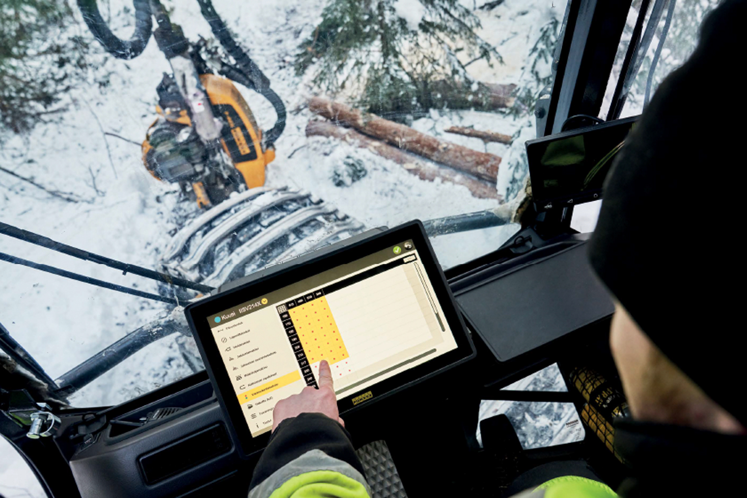
We helped design the user interfaces of forestry machines
TAIO has been helping Ponsse design user interfaces for environmentally friendly forestry machines that meet world-class standards. Together with our customer, we develop tools for future forest management.

ROVIO
We swiftly solved Rovio’s production challenge
Rovio approached us looking for a 2D game designer for their ongoing production. We provided them with a top expert in the field, capable of creating production-ready concept art and a backdrop for the events of the client’s game. In addition, we were pleased to provide a 2D animator to create animations directly in the client’s game engine to create a functional entity. We found suitable professionals for our client’s challenging production in two days and started the work a couple of weeks later. Our cooperation has been mutually rewarding and the project is still ongoing.

DIETA
We upgraded the user interface of dietatec collection’s flagship product
In this case the old system required a complete overhaul to enable the best user experience. We set out to implement the user interface together with the client by applying the best service design methods. There were already some good existing solutions, which we combined with a modernised user interface. This resulted in a coherent and functional user interface that meets the needs of its users.
A needs assessment was carried out by means of an in-depth survey including interviews with trainers and users of Dieta boilers. Using these interviews and the ideas that emerged from the comments, we were able to evaluate and prioritise the most important features and functions of the boiler. We recreated the concept entirely as we began to consider the user experience from the very beginning.
The system was designed for touchscreens and special attention was paid to the choice of components. The starting point was that the system should work for several years. Therefore, the precise selection of components was extremely important. Responsiveness and modernness were emphasised in the technical choices. For example, the challenging nature of the operating environment became apparent when operating the interface with gloves. In a hectic operating environment, it is important to have access to features quickly and without errors.
Dietatec’s business image was taken into account in the visual implementation of the system’s user interface. We picked colours and elements from the company’s image to work as an integral part of the user interface. The implementation emphasises the prioritisation of user needs in addition to clear typography. We also designed all the icons to seamlessly match with the system’s graphic design.

TPI CONTROL
We helped TPI Control save valuable working time
TPI Control was looking for a partner to design a tool that would assist maintenance engineers carry out condition surveys on new buildings and their HVAC systems. Up until now, this had been done by hand on paper, which was later transcribed by another person. This practice was not only outdated, but also very time-consuming and inefficient.
We started the project by completing a comprehensive needs assessment to give us an understanding of our client’s needs. Defining the initial phase is often the project’s most critical and important stage. The consultant must be able to quickly internalise complex data sets and draw conclusions from them. User monitoring is important for the consultant to understand the conditions under which the end-user operates. Since in this case the end-user’s circumstances varied and the goal was for the system to work in all situations, we decided to design the system with a mobile-first approach. We prioritised small screens and their usability in the design.
The system was designed to be functional and as simple as possible. The graphic style was kept very simple according to the client’s wishes. During the testing phase of the project, we noticed that the new system saved the client about 45 min per condition survey report. Our cooperation continues with new projects.

LEANWARE
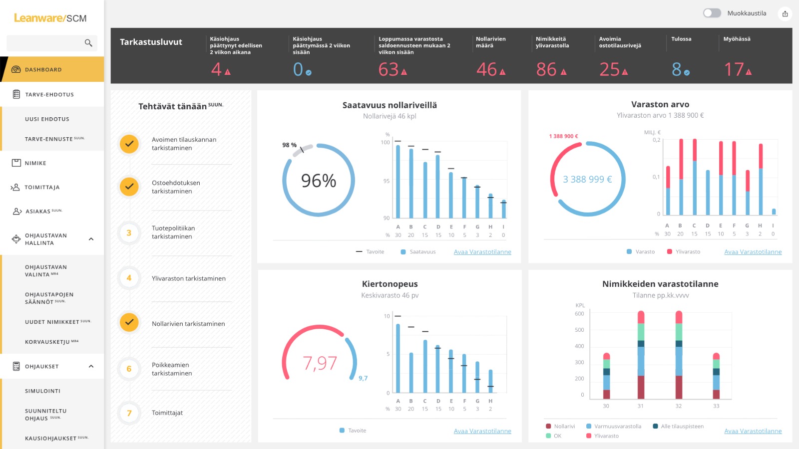
We improved the usability of leanware’s SCM system and created a brand-conforming image for it
We have been working with Leanware for several years already, and now we were entrusted with an existing SCM system*. Our task was to develop the usability of a product containing complex data sets and to create a brand-conforming image for the system. When we started working on this project, SCM was already the best product in the market. It was important to us to maintain its success factors, while further improving the product’s usability. SCM has been in the market for some time already in its current form that we helped design. The reception has been very positive, and our excellent cooperation with Leanware continues.
*SCM is a supply chain management system that enables companies to increase the security of supply as well as optimise inventory and rational purchase batches. SCM can help improve key supply chain management metrics such as availability, inventory value, inventory turnover and workload. Leanware SCM ensures that there are enough raw materials and products available, labour is allocated appropriately, data processing and reporting is easy, and capital is not wasted on overstocking.
Sulake
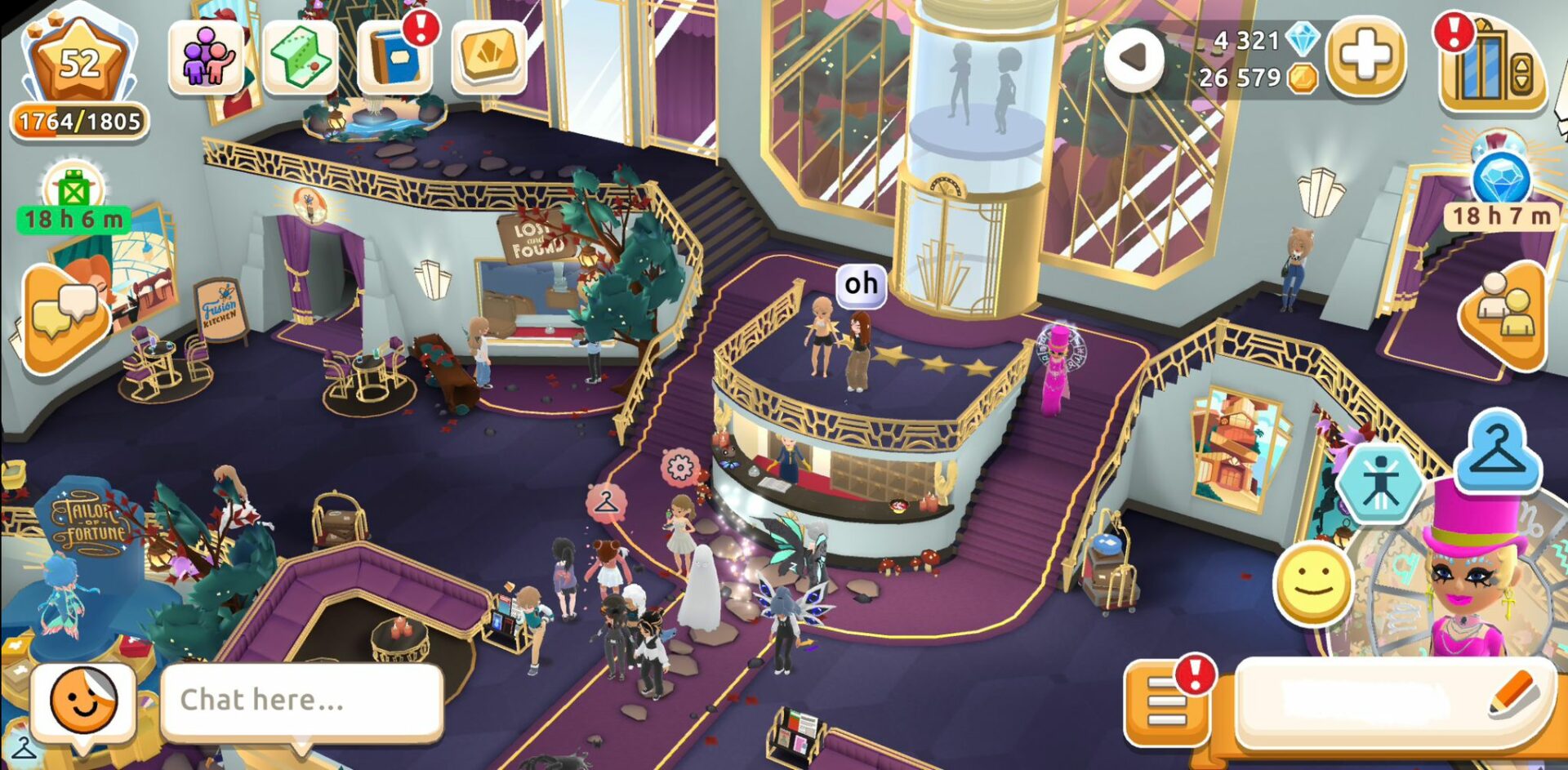
Legendary finnish game company Sulake was very happy to get novel perspective
Legendary finnish game company Sulake was very happy to get novel perspective from one of Taio’s star consultant Dr.Erika Reponen and Jarkko from Sulake described Erika’s work input like this:
I’m writing to recommend Erika Reponen, she contributed significantly to improving our game. She identified key user experience issues, offering practical solutions tailored to our game’s context. Clear communication and collaborative attitude streamlined the process. Erika’s dedication to deadlines and project success was evident throughout. I believe her expertise would be valuable to any company seeking to enhance their product’s user experience.
– Jarkko Kouva, Hotel Hideaway Product